Details
Ontario Parks
Ontario Parks is the government agency responsible for managing and protecting over 300 provincial parks across Ontario, Canada. These parks cover nearly 8% of the province’s land and provide opportunities for outdoor recreation, conservation, and education. They offer activities like camping, hiking and paddling while preserving diverse ecosystems, including forests, lakes, and wetlands. Ontario Parks also focuses on sustainability, biodiversity conservation, and responsible tourism, balancing public enjoyment with environmental protection.
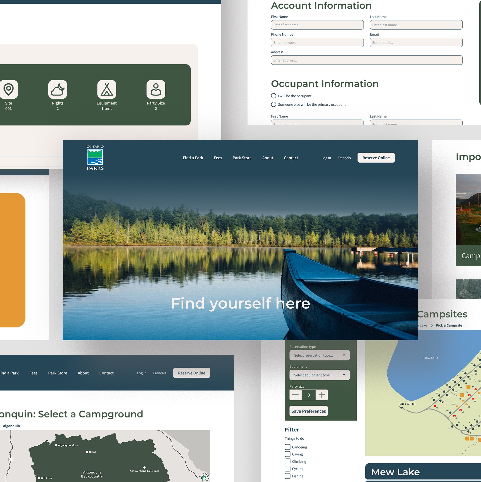
This project entailed a rebrand to modernize the brand’s web identity. The redesign features a refreshed user interface and colour palette. A user journey analysis was first conducted to determine pain points in the navigation. Ultimately the redesign featured these navigation and UI changes.
Services
UI/UX Design
Year
2024
Client
Ontario Parks
Mission
"Replacing digital clutter with intuitive movement to allow campers to spend less time navigating tabs and streamline their booking experience."
Details
Ontario Parks
Ontario Parks is the government agency responsible for managing and protecting over 300 provincial parks across Ontario, Canada. These parks cover nearly 8% of the province’s land and provide opportunities for outdoor recreation, conservation, and education. They offer activities like camping, hiking and paddling while preserving diverse ecosystems, including forests, lakes, and wetlands. Ontario Parks also focuses on sustainability, biodiversity conservation, and responsible tourism, balancing public enjoyment with environmental protection.
This project entailed a rebrand to modernize the brand’s web identity. The redesign features a refreshed user interface and colour palette. A user journey analysis was first conducted to determine pain points in the navigation. Ultimately the redesign featured these navigation and UI changes.
Services
UI/UX Design
Year
2024
Client
Ontario Parks
Mission
"Replacing digital clutter with intuitive movement to allow campers to spend less time navigating tabs and streamline their booking experience."

A map that shows the user journey of the existing parks website.

A more detailed diagram to highlight navigation redundancies and clutter.

The homepage scrolling journey.
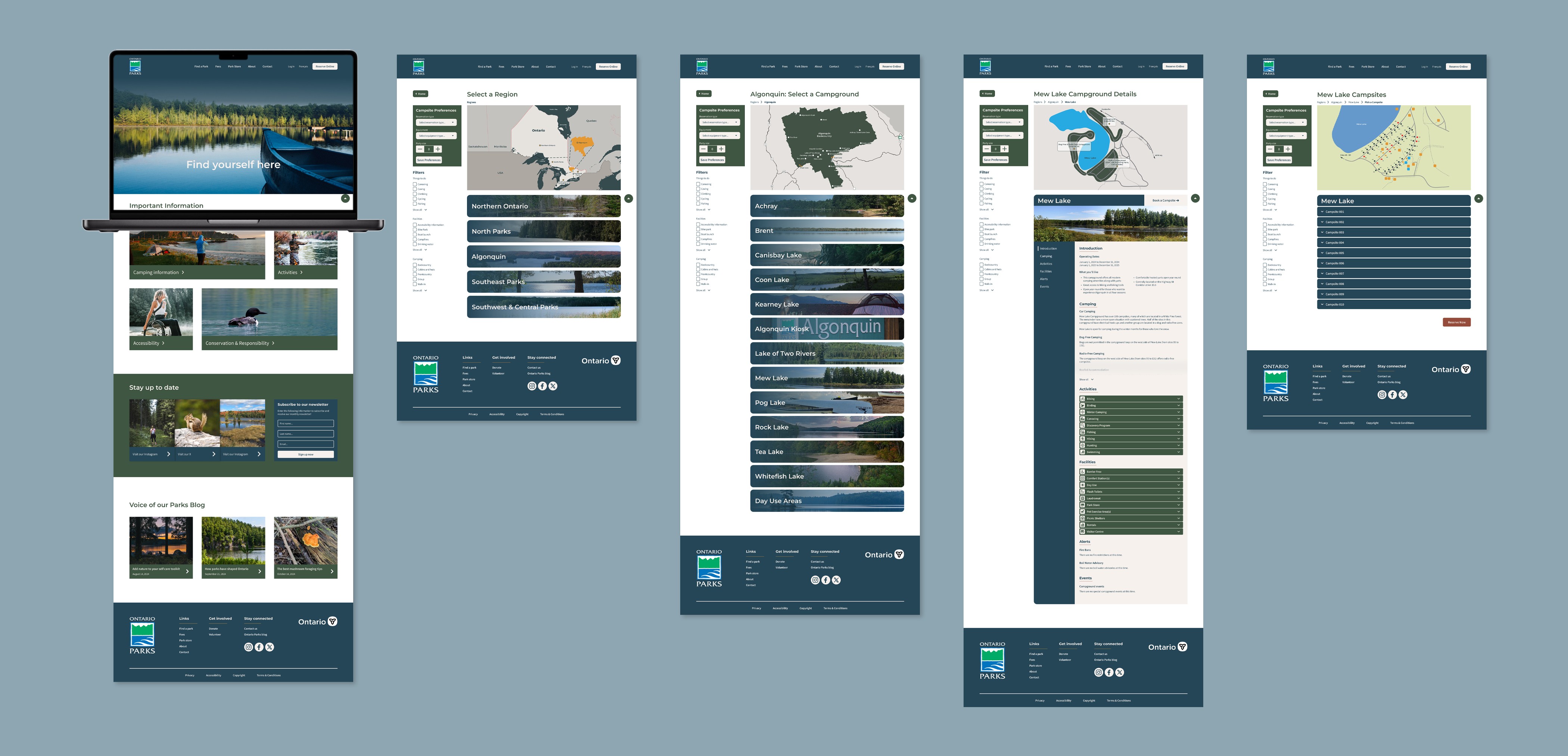
An overview of the redesigned user booking journey.

An overview of the redesigned user checkout journey.
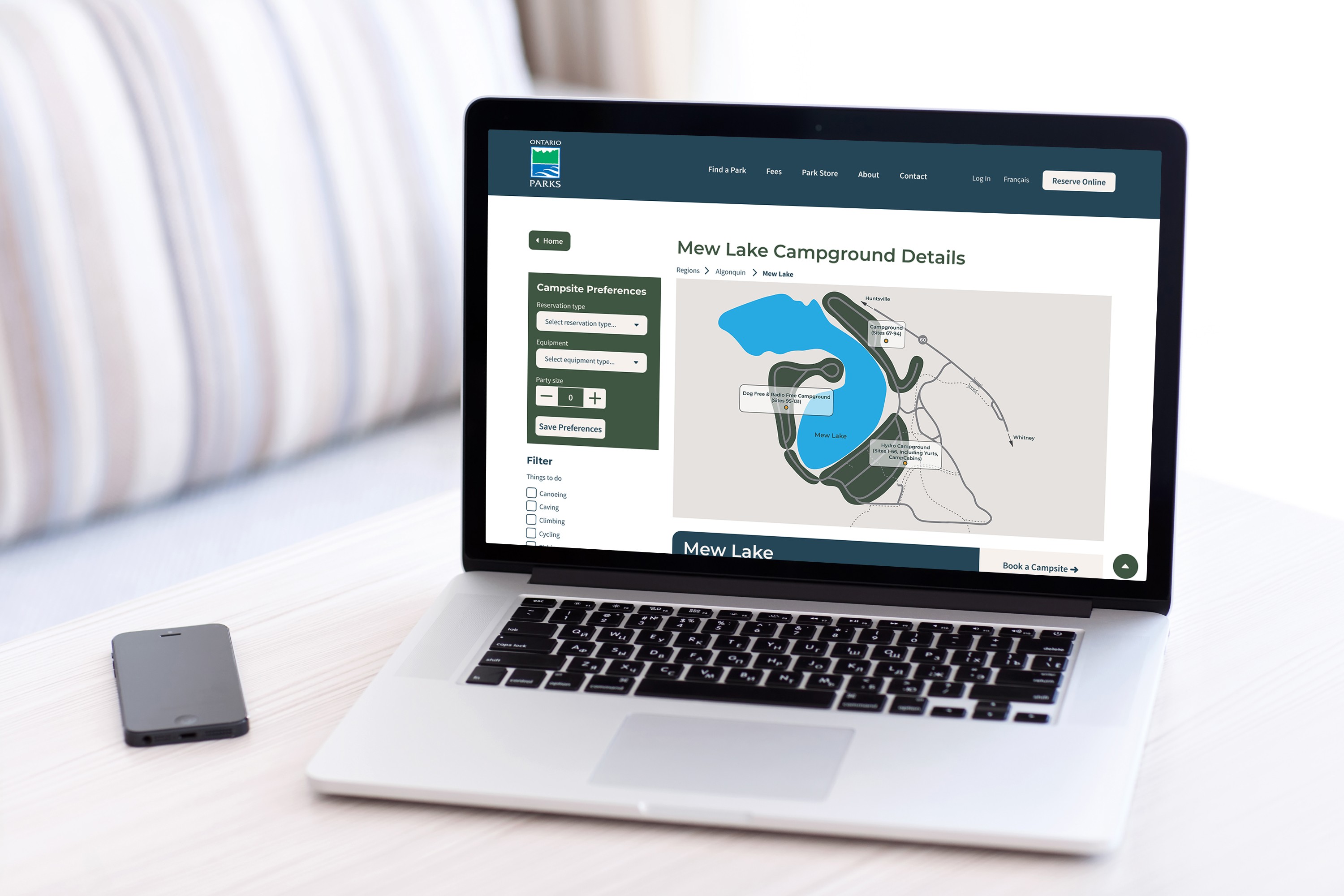
A mockup of the laptop user interface.