Woman walking through a field with Bramble logo imposed in center of image

Details

Bramble

Bramble is an expressive outdoor equipment and clothing brand that offers a variety of hiking, camping, backpacking, rock climbing, and canoeing products, amongst many more. They design high-performance gear that blends functionality, durability, and sustainability. Their commitment to eco-conscious production is at the forefront of everything they do, so that we can all enjoy nature’s beauty for a long time to come.

This project was split into multiple parts, including the initial brand creation stage, subsequent print, web and digital collateral design, and finally a print, web and social media campaign strategy.

Services

Brand Identity

Year

2025

Client

Bramble

Mission

"The brand should feel playful but put together. It should reflect the elements and quality of the product they offer."

An animated gif of Bramble's logo. The wordmark animates in letter by letter. The background is yellow with a dark teal logo.

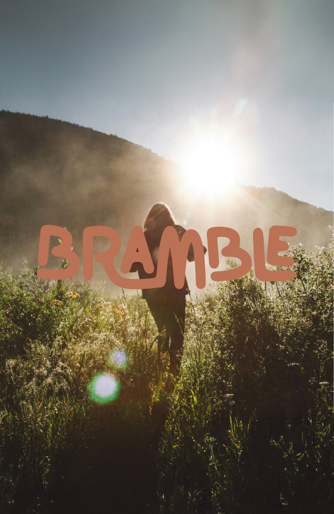
Bramble wordmark logo - the fluidity and structure of the wordmark is a play on the word 'bramble' itself, which is a type of bush or vine with organic flowing branches

An image showing eight outdoor-themed icons arranged in two columns of four, set against a split background of dark teal on the left and light orange on the right.  The icons are styled with thick, rounded lines and set within soft, organic square containers. The colors are inverted across the center: yellow icons on teal, and teal icons on yellow.

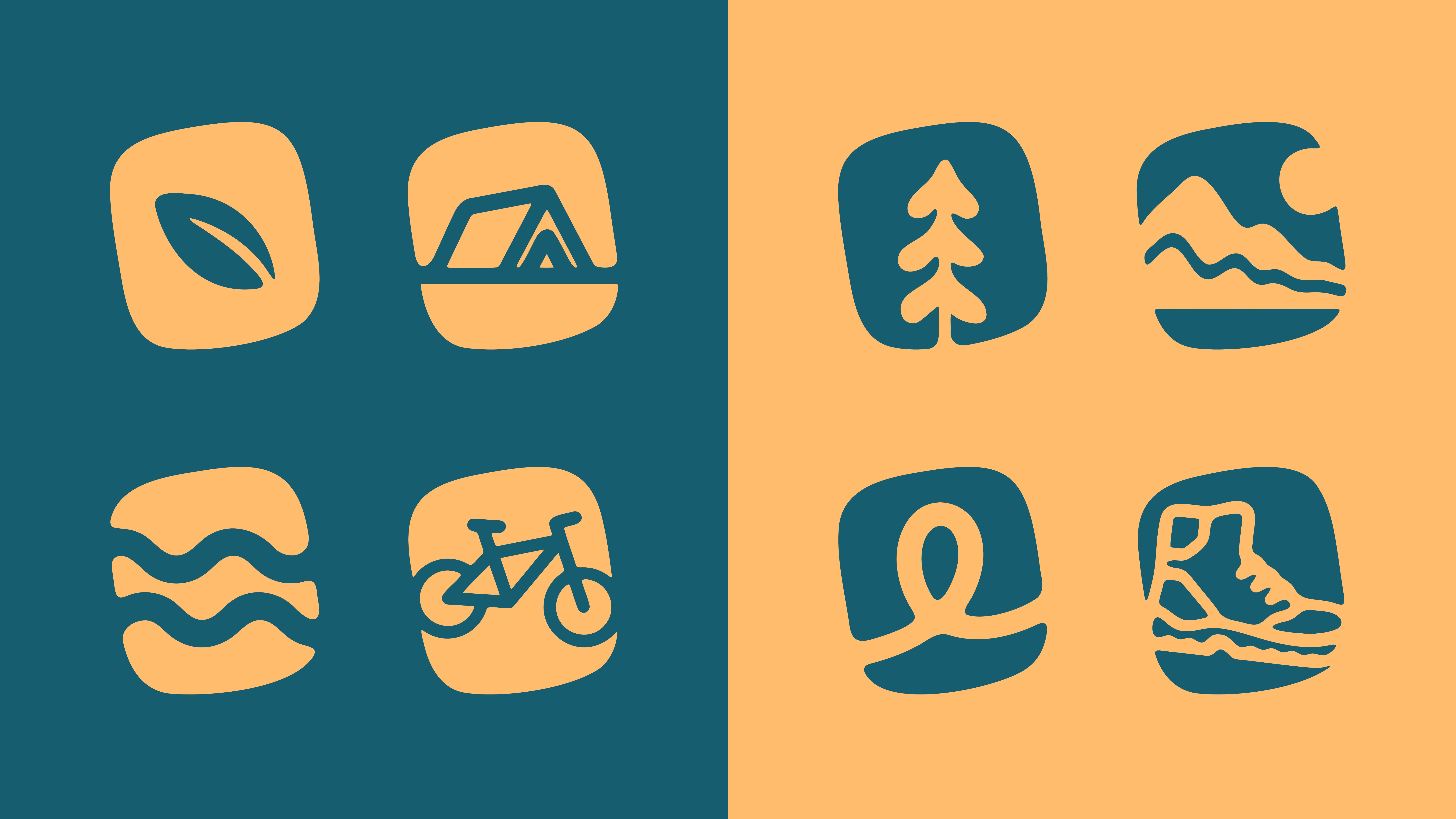
Icons to represent different categories of product either in-store or online

The brand's colour palette. The main colour on the left is the largest swatch. The colours on the right are the supporting colours. Each have a label with colour name, HEX code, and other colour information.

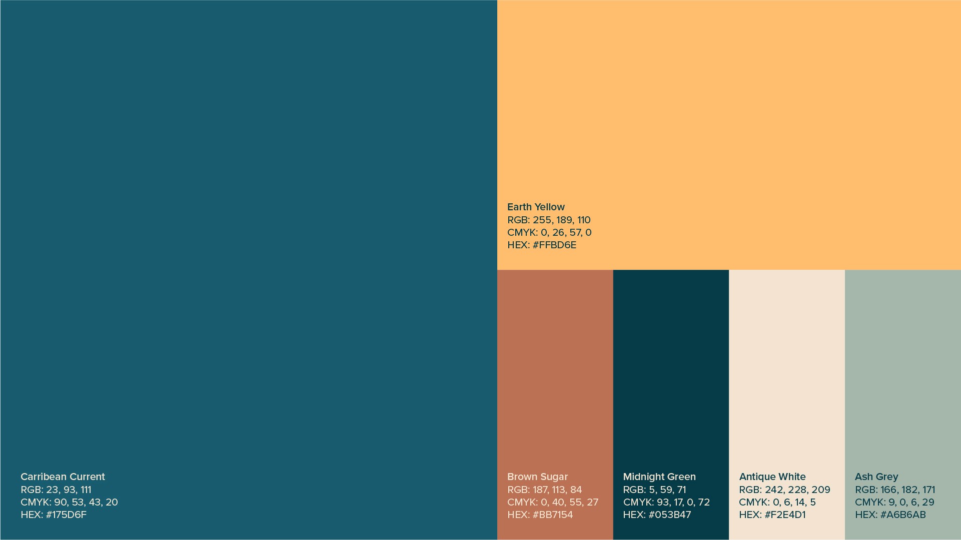
Bramble colour palette - the colours reflect the earthiness and approachability of the brand. They are calm but still a bit playful and grounding.

The mobile profile for BrambleCo showcases a cohesive brand identity that mirrors the organic, outdoor-themed iconography previously established. The interface features a dark teal logo and a series of story highlights—such as "Our faves" and "Winter"—that utilize the same rounded, minimalist icon style and orange-on-teal color palette. Below the profile information, a grid of lifestyle photography displays mountain landscapes, hiking gear, and camping scenes, effectively positioning the brand as a provider of equipment for unique outdoor adventures.

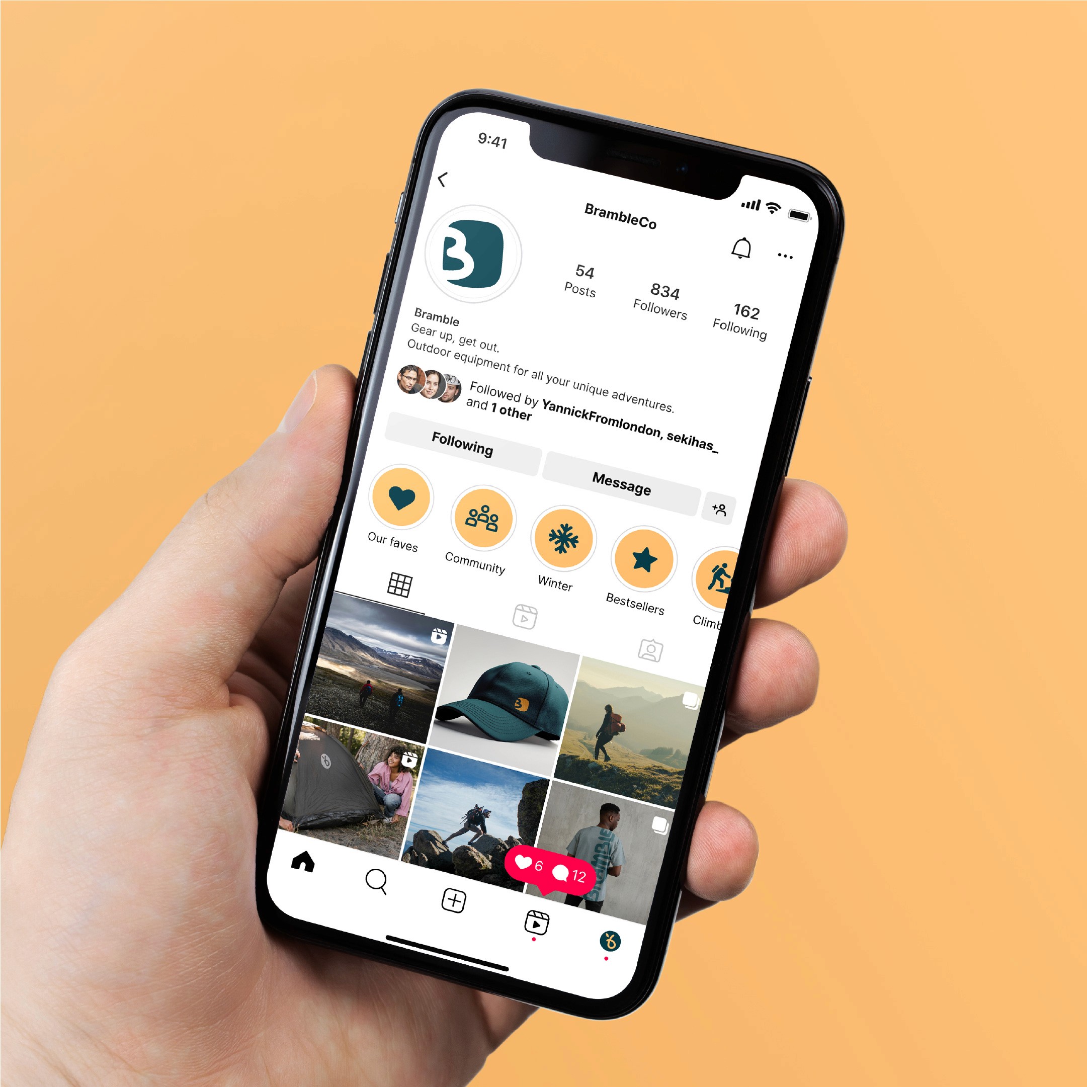
The Bramble instagram account home page – mockup on iphone

The first image shows a hand holding a smartphone against an orange background, displaying the BrambleCo Instagram profile with its teal logo, minimalist story highlights, and a grid of outdoor lifestyle photography. The second image features a "2025 Catalogue" resting on sand, showcasing a sunlit landscape cover with the bold headline "Gear up for every adventure" and a dark teal brand banner at the bottom.

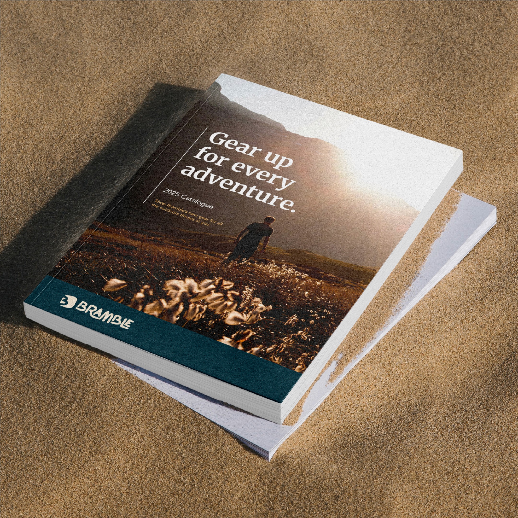
Product catalogue mockup

These images showcase the brand identity and marketing materials for Bramble, an outdoor equipment company. The first image displays the BrambleCo Instagram profile on a smartphone, featuring organic teal icons for story highlights and a grid of rugged landscape photography. The second image features a physical 2025 Catalogue resting on sand, with a full-bleed cover photo and the bold headline "Gear up for every adventure". The final image is a brand guidelines page specifying Merriweather Bold as the primary heading typeface, chosen for its high readability on screens.

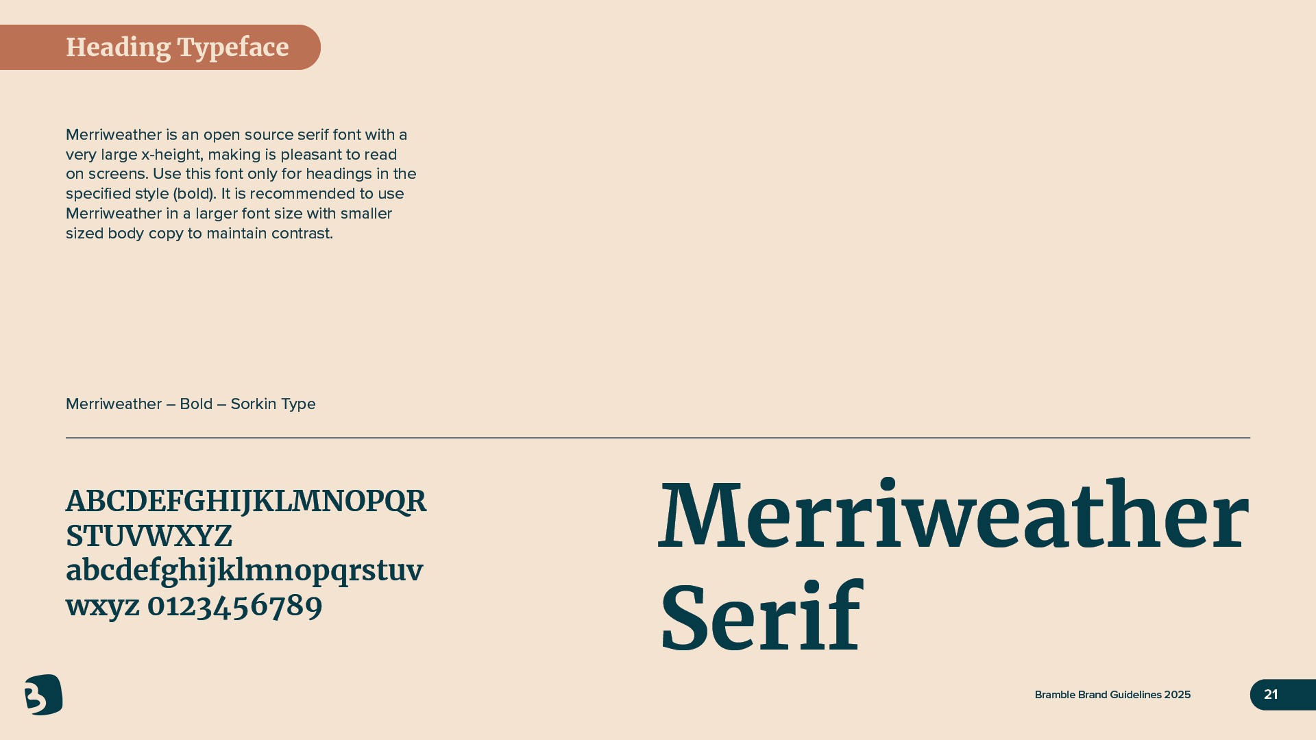
The main heading font feels grounded and classic while also playful. The strong strokes pair well with the more delecate secondary brand typeface.

This brand guidelines page specifies Proxima Nova Medium as the official body typeface for the Bramble brand. It is described as a sans-serif, round grotesque style intended for use in all body copy text.

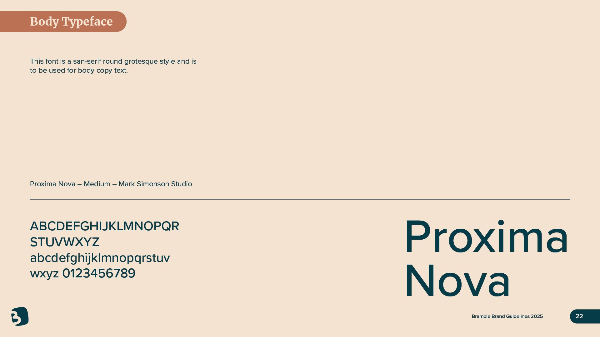
The secondary typeface is more streamlined to juxtapose with the boldness of the heading typeface. It's legible, still playful but also professional and edgy.

Two marketing leaflets for the outdoor brand Bramble are shown overlapping on a neutral gray surface, featuring a continuous wavy orange line that connects the visual elements across both pieces. The top leaflet contains a dark teal section with the white Bramble logo and the slogan "Gear up, get out," alongside a promotional offer for 50% off camping gear for newsletter subscribers. The right side of this leaflet displays a photograph of a person wearing rugged hiking boots on rocky terrain. The bottom leaflet features a warm orange-to-yellow gradient background with the bold teal headline "The outdoors are calling," while the wavy orange line continues into the corner to form a looped, trail-like shape.

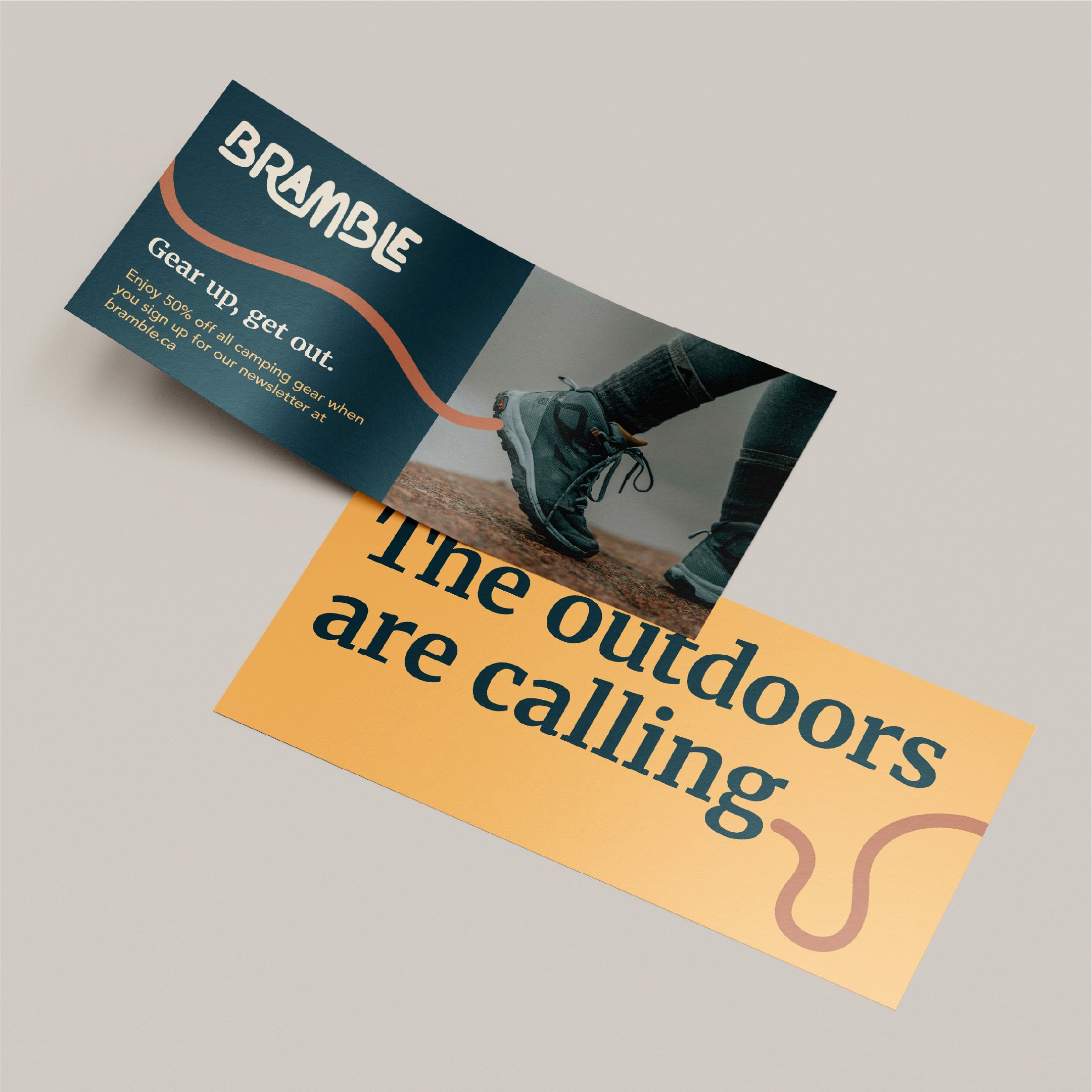
Direct mailer or coupon.

 Gemini said A grid of professional business cards for the outdoor brand Bramble is displayed on a neutral surface, showcasing both the front and back designs. The front of the cards features the Bramble logo in a light orange, organic typeface centered on a textured teal background. The back of the cards uses a cream-colored background with a thin, loopy orange line running horizontally across the center. This side includes contact details for John Appleseed, the Chief Financial Officer, including a (416) area code phone number, a company email address, and the bramble.ca website URL.

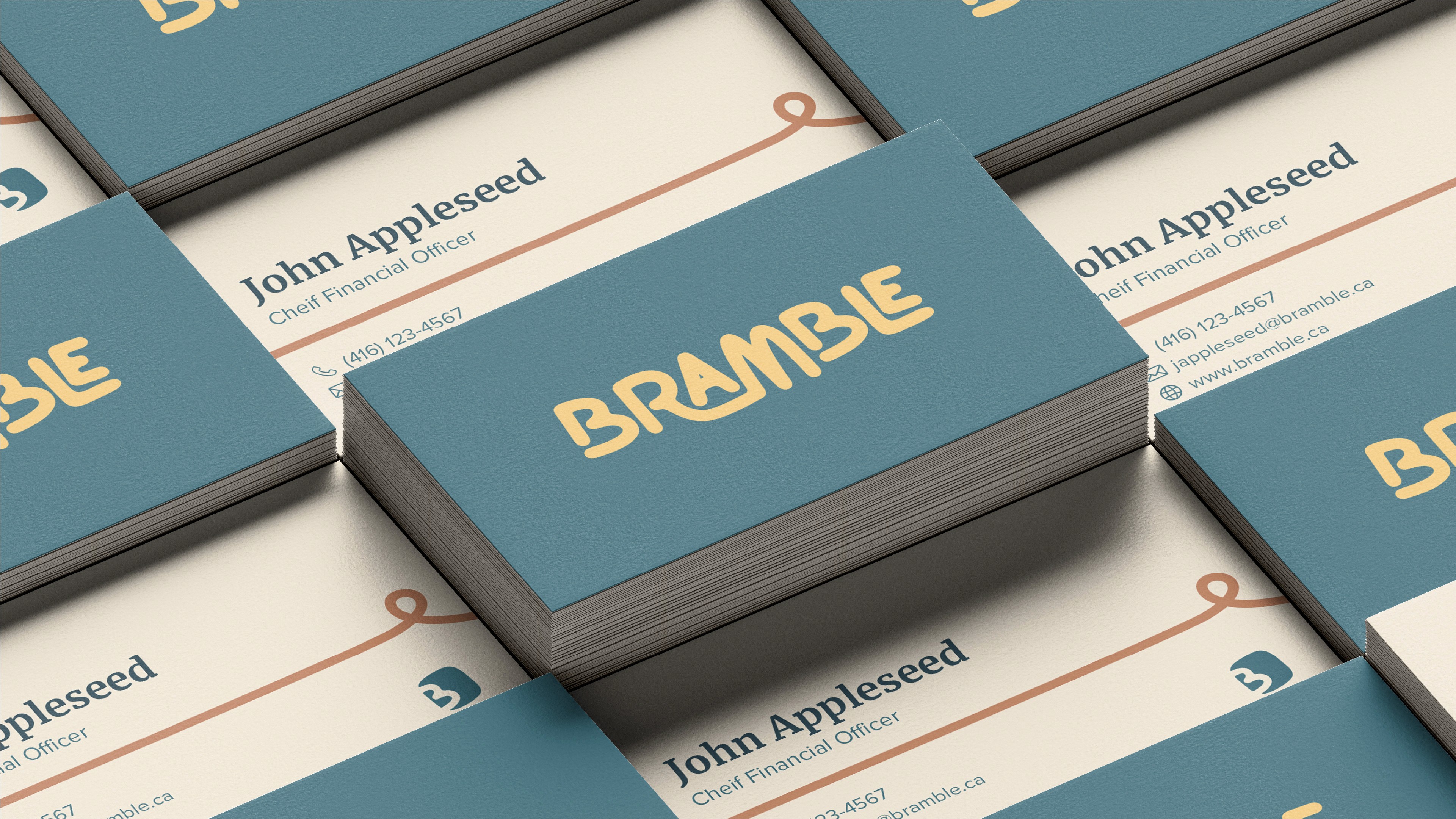
Branded business cards.

This image features a cardboard shipping box for the outdoor brand Bramble, positioned against a plain white background. The box is secured with a wide, dark teal packing tape that prominently displays a repeating white pattern of the brand's organic "B" logo. The top of the box is printed with the Bramble wordmark in white, while the side features the brand's slogan, "Gear up, get out," in a white serif typeface.

Shipping packaging.

This image presents a high-angle, isometric view of various pages from the Bramble Brand Guidelines spread out across a white surface. The layout includes several key sections of the brand's identity, such as a Table of Contents, Brand Voice, and a Primary Palette featuring teal, orange, and cream colors. Other visible pages showcase Colour Accessibility charts, a Product Moodboard filled with outdoor photography, and various iterations of the brand's organic logo and wordmark. The overall presentation uses a clean, professional aesthetic to demonstrate the comprehensive visual and strategic rules for the outdoor equipment brand.

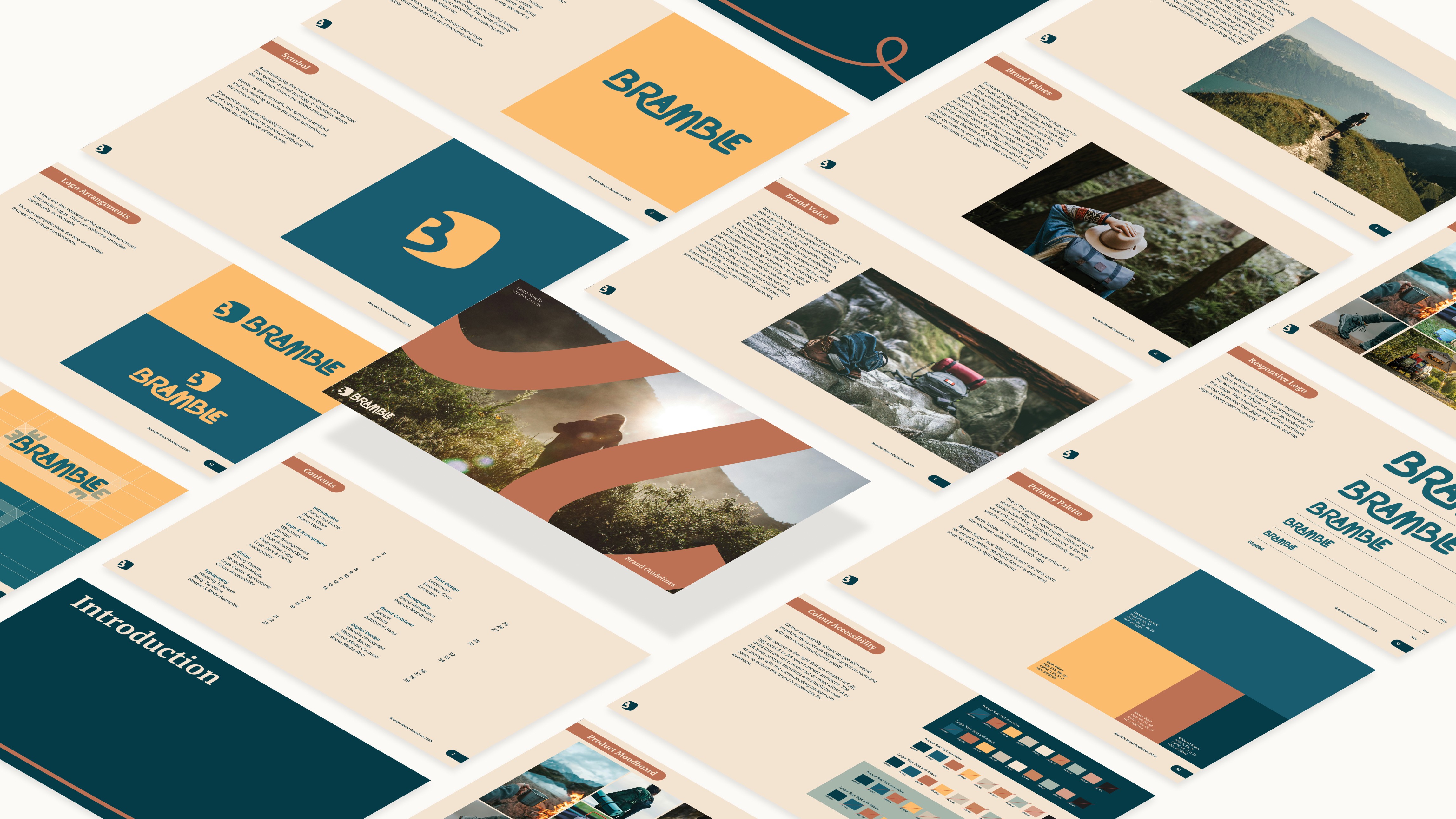
Pages from the Bramble brand guidelines.

 Gemini said Three outdoor advertising posters for the brand Bramble are displayed in a row on a metal fence along a sidewalk, set against a backdrop of lush green trees. Each poster features a large, atmospheric photograph of an outdoor activity—canoeing, rock climbing, and hiking—accompanied by the bold teal and orange headline "Envision your wild". The posters specify different locations such as Sauble Falls, Sleeping Giant, and Killarney Provincial Parks, and include a dark teal footer with the Bramble logo, a QR code, and the call to action, "Ready for an adventure?".

Print campaign posters advertising a collaborative summer initiative with Ontario Parks

This image shows a person holding a smartphone that displays an Instagram post from the account Bramble.co. The post features a scenic photograph of a coastline with mountains and a tent at Tidewater Provincial Park, overlaid with the bold headline "Picture you here." and a dashed white silhouette of a person. A campaign hashtag, #ShareYourWild, and the Bramble logo are visible at the bottom of the image, while the caption encourages users to join in by sharing how they embrace their adventures. The phone's interface also shows various user story icons at the top and standard engagement features like likes and comments at the bottom.

Digital campaign in partnership with Ontario Parks

A stack of three promotional coupons for the brand Bramble is shown fanned out against a neutral cream background. Each coupon features a dark teal left-hand section with the orange headline "The outdoors are calling." and a sub-headline offering a 25% discount on camping, hiking, and rock climbing gear. The right-hand side of each card is a textured cream color and features a large, circular park badge; the top badge clearly identifies "Sleeping Giant Provincial Park" with an orange and teal illustration of a tent and trees. Tiny text on the cards encourages customers to collect all Ontario Parks campground stickers.

Print campaign in partnership with Ontario Parks - coupon with collectible sticker